The challenge
To remain competitive and appealing both brands, Migros-Restaurant and Migros-Take-Away, require a design refresh. At its core lies a simple, consistent appearance as well as a direct, contemporary imagery and narrative style.
The solution
The new look is clear, concise and catchy, making it quick and easy to understand. The zeitgeisty communication strengthens gastronomy brands whilst positively reflecting back onto the umbrella brand.
The history of Migros began in 1925 – with its first five sales trolleys. Today, it is the largest retailer in Switzerland, consisting of ten cooperatives spread throughout the country. It employs around 100,000 people and operates over 300 restaurants and take-aways. We have given these two gastronomy worlds a fresh, zeitgeisty look. It enables customers to get better orientation quickly while providing with great flexibility of usage.
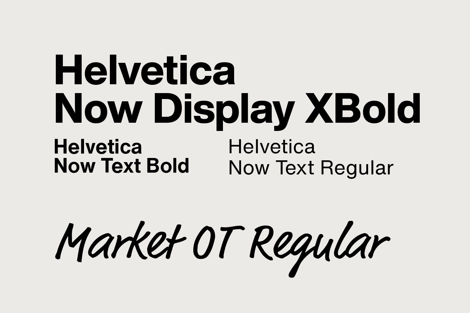
All the design elements of the Migros-Restaurant and Migros-Take-Away brands have been modernised. The primary colours black, orange and white are complemented by a “warm grey” and a secondary colour palette. The existing fonts have been retained, yet with a new approach to typography, greater clarity is ensured.
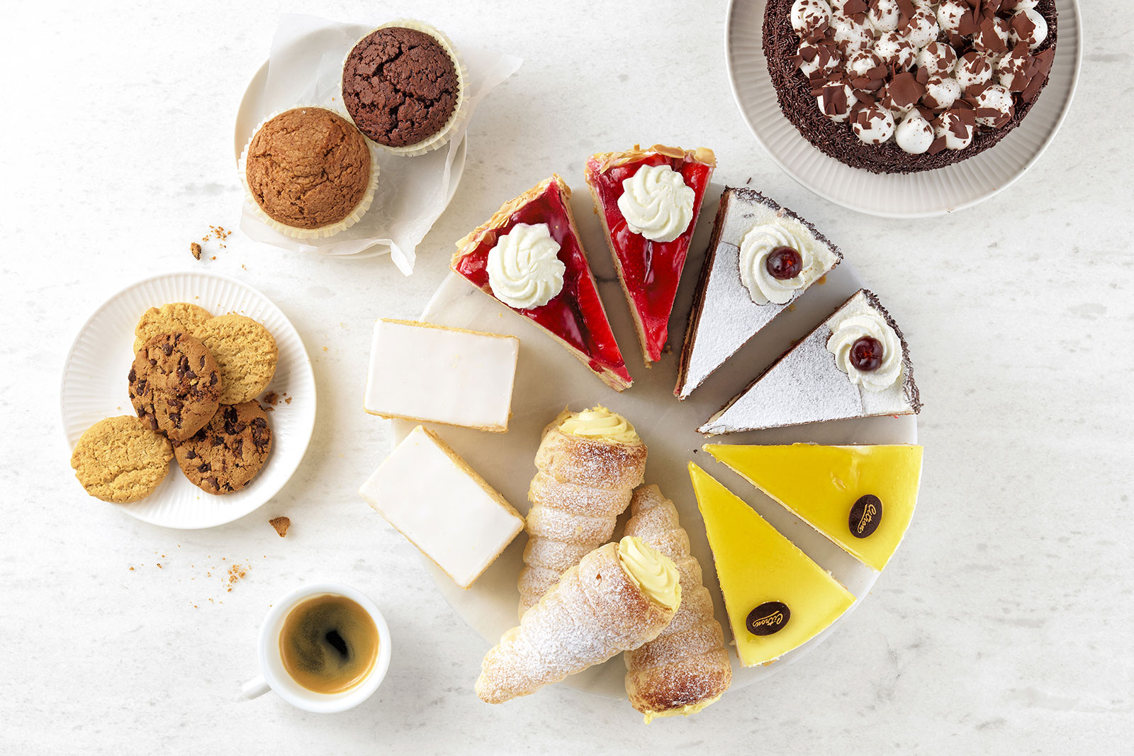
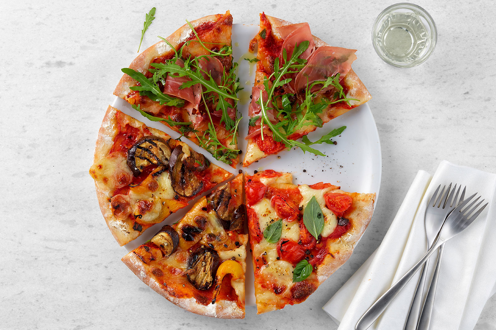
The new brand appearance guarantees a consistent overall appearance for every gastronomy touchpoint. It focuses on the aspects of quality and proximity and looks as diverse as it is appetising. The stamp-look illustrations have been redesigned – they complement the food photography and written text, and can be used in a wide variety of formats.
A custom-specific “toolbox”, packed with different templates, serves as a set of instruments for the smooth implementation of the image. This will allow the individual Migros cooperatives to implement the new design quickly and largely independently.
Colourful, uncontrived and varied: the characteristics applicable to the culinary range served as a leitmotif for creating the new visual language, in terms of sales and image promotion alike. At the same time, it was ensured that the Migros brand tonality – warm, close, authentic – was also expressed in the new look. The communication language of the new imagery leads to better practicability, which, in return, allows greater flexibility.
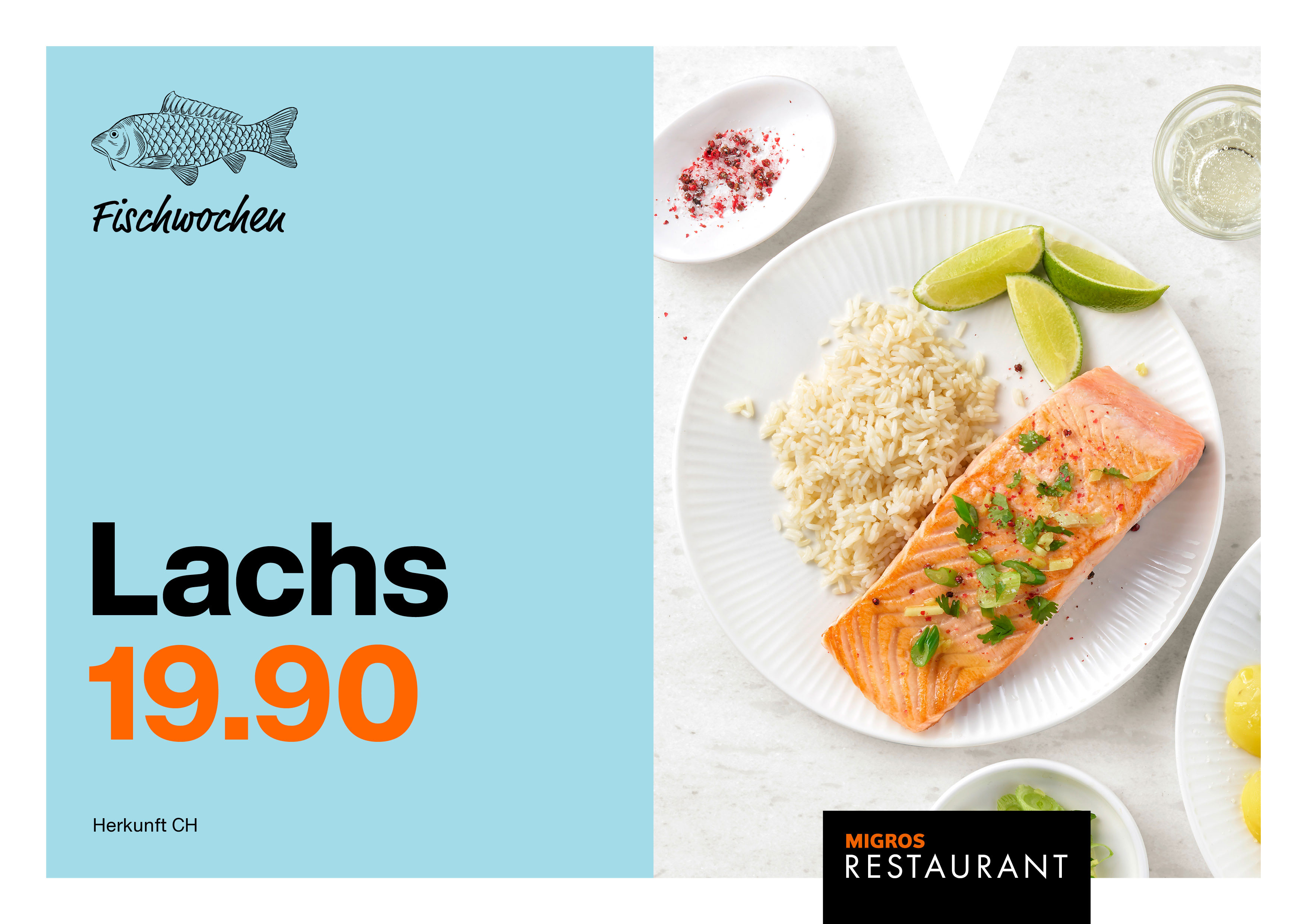
The existing M-stage remains the defining element of the Migros communication and ensures a consistent overall look across all topics, media and applications. Together with the logo, it forms a visual bracket that is visible in all brand-shaping communication media.
The layout system has however been expanded: the option of a split-screen look allows for greater flexibility without losing the reference to the Migros-Gastro appearance. The separation of image and text opens up new possibilities in communication, especially for sales promotion purposes.
The new rules for the use of language further strengthen the look. Here, too, the basic principles of simplicity, authenticity and variety are key. The language should not only be informal and lively, but also surprising and entertaining. The aim is to always get straight to the point without ever compromising on clarity.
The Migros-Gastro slogan is the communicative translation of the guiding idea and expresses uncomplicated pleasure in the shortest possible way: “Simply good”.
Website: migros.ch


